140M customers later, Nubank doubles down on purple
Nubank entered the US as Nu and kept the purple fintech copied. Inside the rebrand: Nu Sans type, playful motion and a lesson in owning brand codes.
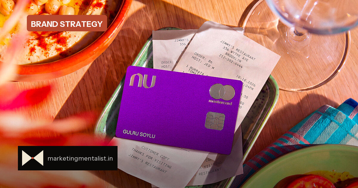
When Nubank entered the U.S. last month under the name Nu, compliance, legal work and auditing were not the hardest part. Cofounder Cristina Junqueira says the brand was. “The brand is, in my opinion, the hardest thing that we need to do,” she tells Fast Company, because there is “no playbook.”
The category stole its signature colour
Founded in 2013 with a purple outline logo of mirrored shapes, Nubank grew to more than 140 million customers across Brazil, Mexico and Colombia. Its only major visual refresh came in 2021, when it filled the logo in purple. But as the bank prepared for deeper international expansion, the colour it helped define had become a fintech default.
“Purple is everywhere in fintech,” says Arthur Foliard, executive creative director at Koto. “You see it more and more.”
What changed beyond the purple
Nu kept the colour and rebuilt the system around it. The new identity includes:
- Nu Sans, a proprietary typeface designed to be expressive at headline sizes and legible in app interfaces.
- Whimsical illustrations with an optimistic feel, such as a figure walking on a path on the welcome kit.
- Tactile packaging, including metal cards, a magnetic closure and stickers.
- Bouncy motion in kinetic typography and app UX.
Foliard says the result feels fun, colourful and exciting, and that is where the Brazilian vibe comes through. Crucially, the team did not try to Americanise the brand; it wanted to look global.
Why this matters for brand builders
Distinctive brand assets—colours, logos, typefaces—work when they trigger recognition. But a single asset is fragile. Once competitors adopt your colour, the link weakens. Nu’s answer was not to abandon the asset, but to re-contextualise it: the same purple now sits inside a sharper typographic, illustrative and motion system.
For marketers, the practical move is to audit which brand codes have become category codes. If a signature colour or style has spread, don’t panic and dump it. Rebuild the surrounding elements until the asset feels owned again, and resist the urge to over-localise.
Source: Fast Company