AdFest’s 30th-anniversary logo uses paper and negative space
AdFest's 30th-anniversary logo uses a bent paper strip and negative space to unite trophy, lotus and gateway. Here's why the rebrand works.
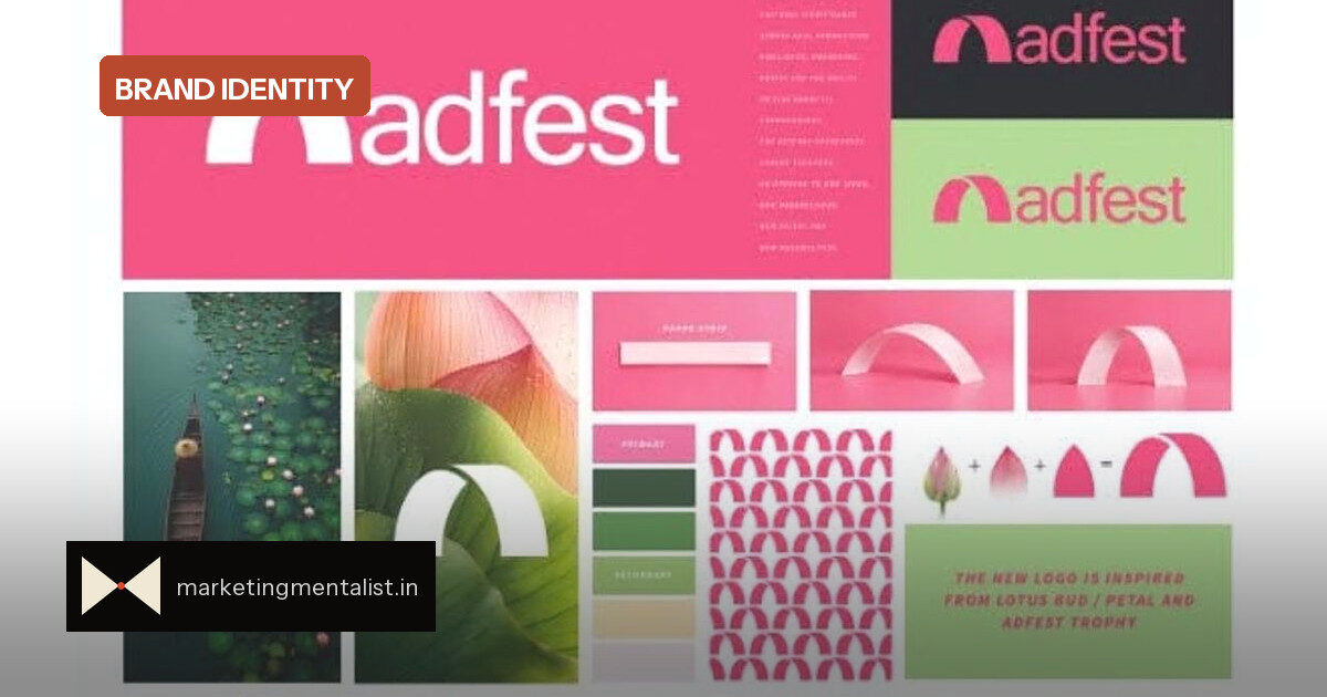
AdFest is getting a new look just before a milestone. The creative festival, which returns to Pattaya from 18 to 20 March 2027 for its 30th edition, has unveiled a logo created by Santosh Padhi, founder and chief creative officer of Mumbai-based Into Creative.
The mark and the thinking
Padhi’s design starts with a single bent strip of paper. The shape it leaves behind does several jobs at once: it suggests the AdFest trophy, a lotus bud or petal, the letter A and an open gateway. Baby pink leads the identity, with pastel green as a secondary shade, both linked to the lotus.
“A simple piece of paper gave birth to the new logo,” Padhi told the festival. That phrase is more than a nice line: he and his team reportedly presented the idea on Zoom by physically bending paper, and the room responded to the immediate clarity of the form.
Why negative space is a branding shortcut
This logo leans on a principle every marketer can use. Negative space lets the viewer complete the symbol themselves, which makes the mark feel more involving and easier to remember. A single shape holding multiple meanings, trophy, lotus, gateway, letterform, compresses the brand story into one image instead of asking an audience to decode complexity.
It also solves a classic rebrand tension. AdFest chairman Vinit Suraphongchai said reaching 30 years is significant, but “we don’t see it as a moment to look backwards. It is a moment to look forward.” The lotus and trophy carry heritage, while the gateway and paper strip signal motion and creative process. The identity says legacy without seeming locked in the past.
What brand teams can steal
For a brand manager, the AdFest identity offers three practical moves.
- Prototype with the real object. Padhi bent paper rather than hiding behind slides. Physical demonstration makes an abstract idea instantly believable.
- Let one device carry several meanings. The folded strip is trophy, lotus, A and gateway. That gives every audience a reason to see themselves in the mark.
- Use colour to anchor meaning. Baby pink and pastel green connect the design to the lotus, so even a minimal form has cultural reference points.
Rob Sherlock, chair of the AdFest Collective Advisory Board, framed the stakes: technology, media and culture are broadening what creativity means, and the festival sees itself as the place where those worlds meet while remaining “unmistakably Asian, deeply human and genuinely connected.” A simpler mark, in that context, becomes a way to stay open rather than a retreat into nostalgia.
The 2027 festival runs at the Royal Cliff Hotels Group in Pattaya, Thailand, and will mark 30 years of its awards and community programmes.
Source: Afaqs!