How a record 45% of independents reshaped campaign branding
When 45% of U.S. adults call themselves independent, candidates strip party colours from logos. Here's what brand managers can learn from the shift.
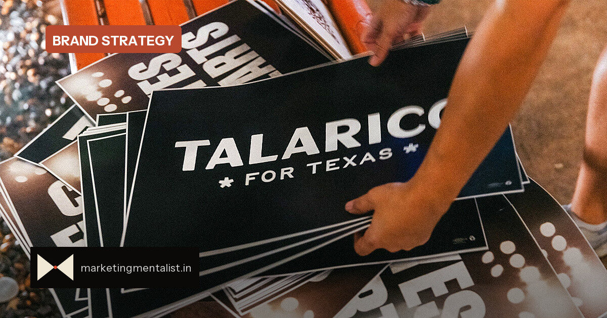
When designer Griffin Glaze took on James Talarico’s U.S. Senate campaign identity, she had ten days to make a Texan candidate feel anything but party-political. The solution: a black-and-white visual system built around hand-painted Baptist church signage, deliberately rough typography and asterisks standing in for Texas stars.
It was a positioning decision, not just an aesthetic one. “A lot of what they were looking for was something that felt different,” Glaze told Fast Company. She said the brief was about being “a bridge builder” whose logo did not make voters “immediately jump to a specific party.”
The category is rejecting its own codes
Across the midterm campaigns, this is more than one designer’s trick. Gallup polling earlier this year found 45% of U.S. adults self-identify as independent—a record high. With both major parties and the president unpopular, candidates have a rational incentive to look unaffiliated. That is showing up in logos, mailers and advertisements.
Independent candidates write the word “independent” directly into their marks. Democrats and Republicans use subtler signals. In the Iowa governor’s race, for instance, neither campaign website mentions the candidate’s party or President Donald Trump. Both campaigns use green as their colour, and both logos gesture at unity: Republican Zach Lahn’s mark says “Iowa First,” while Democrat Rob Sand pairs shaking hands with the tagline “Governor for All.”
Why this matters for brand managers
Political campaigns are doing what challenger brands do when a category turns toxic: they reject the category’s visual conventions and claim a different space. When party colours, symbols and typography are all saturated with meaning, the most distinctive move is to refuse them.
For commercial brands, the lesson is sharper than “be neutral.” It is about understanding which cues your category overuses, and whether removing them can make you more memorable. Think of a fintech brand that avoids the blues and generic “bank” imagery, or a D2C food label that drops the craft-paper look.
Three moves stand out from the political work:
- Test in black and white first. If your identity still works without colour, it is carrying its own weight.
- Replace a cliché with a local texture. Glaze used church-sign lettering and imperfect edges to signal warmth and authenticity instead of party machinery.
- Make the audience’s identity the point. “Iowa First” and “Governor for All” speak to voters, not to a party apparatus.
The risk of looking like nothing
The tension is obvious: remove too many category cues and you may become generic rather than distinctive. A logo that says nothing can be as forgettable as one that screams. The strongest examples in this wave still have a point of view—a texture, a phrase or a symbol—so they read as “above the fray” rather than “empty.”
For marketers, that is the real brief. You do not need to hide what you are; you need to decide which visual codes are worth keeping and which are dragging you into a comparison you cannot win.
Source: Fast Company