Five Fonts Give Major League Baseball a Brand Built to Last
Inside MLB's multiyear brand refresh: five type designers revive early baseball styles for a system that works on apps, venues and social screens.
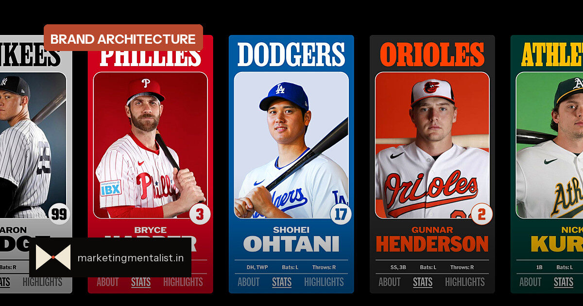
Major League Baseball has a new visual system, and it arrives with a quiet piece of marketing wisdom built in: the most recognisable things are often the last ones you should change.
After moving into a new New York City headquarters in 2020, MLB reached out to Mother Design, the agency behind work for Cadillac, Tripadvisor and Air Up, to make the league’s sprawling identity feel unified. The agency began building MLB’s new brand architecture in late 2022, and the refresh started rolling out in 2024. Now the system is complete.
The league’s silhouetted batter logo, created by Jerry Dior in 1968, was left untouched. The wordmark, by contrast, was updated to fit a far larger visual system.
Five fonts, one brand voice
Mother Design tapped five type designers or foundries, each chosen for a specialty, to create a one-of-a-kind font book. The result is five typefaces—MLB Franklin, MLB Clarendon, MLB Flare, MLB Block and MLB Script—now visible across the Ballpark app, venues, social channels and special events.
The selection principle matters as much as the fonts. Each style was already present in baseball in the early 20th century in some form. Mark Sloan, head of design at Mother Design’s New York office, told Fast Company that these letterforms have been “part of our visual vernacular for longer than any of us have been alive.” The harder question, he says, is how to honour that tradition while building for modern formats.
Old cues, modern constraints
This is not nostalgia for its own sake. Sloan says the real challenge was carrying that tradition forward while making the letterforms ready for retina screens and very small spaces, not just large emphatic moments. In other words, the brand had to work on a phone notification and a stadium banner at the same time.
That dual demand is a useful lens for any brand team. Familiar lettering borrows the trust people already have in a category; modern execution keeps it usable across every touchpoint. Psychologists call the underlying effect mere exposure: repeated visual cues feel safer and more legitimate over time, which makes heritage design a quiet persuasion tool.
What to borrow from MLB’s playbook
For brand managers and founders, the refresh offers a clean framework:
- Keep the mark that carries memory, and refresh the system around it.
- Anchor new work in visual codes your audience already recognises.
- Give every asset a job across both tiny and oversized formats.
- Bring in specialists for high-stakes identity details instead of forcing one generalist to do everything.
MLB Script, designed by Bay Area foundry OH no Type Co., shows the value of that specialist approach. The variable typeface includes flags and a horizontal underline that sweeps from a word’s final letter—details that read as unmistakably baseball without shouting.
The larger lesson: a brand refresh should feel like continuity, not replacement. MLB could have modernised everything, but it chose to protect the one symbol already wired into fan memory and spend its effort on the system that surrounds it.
Source: Fast Company