Rexona turns Messi’s movement into a font
Rexona Argentina's free GOAT Font converts Lionel Messi's dribbles into usable letters and shows how brands turn fame into assets.
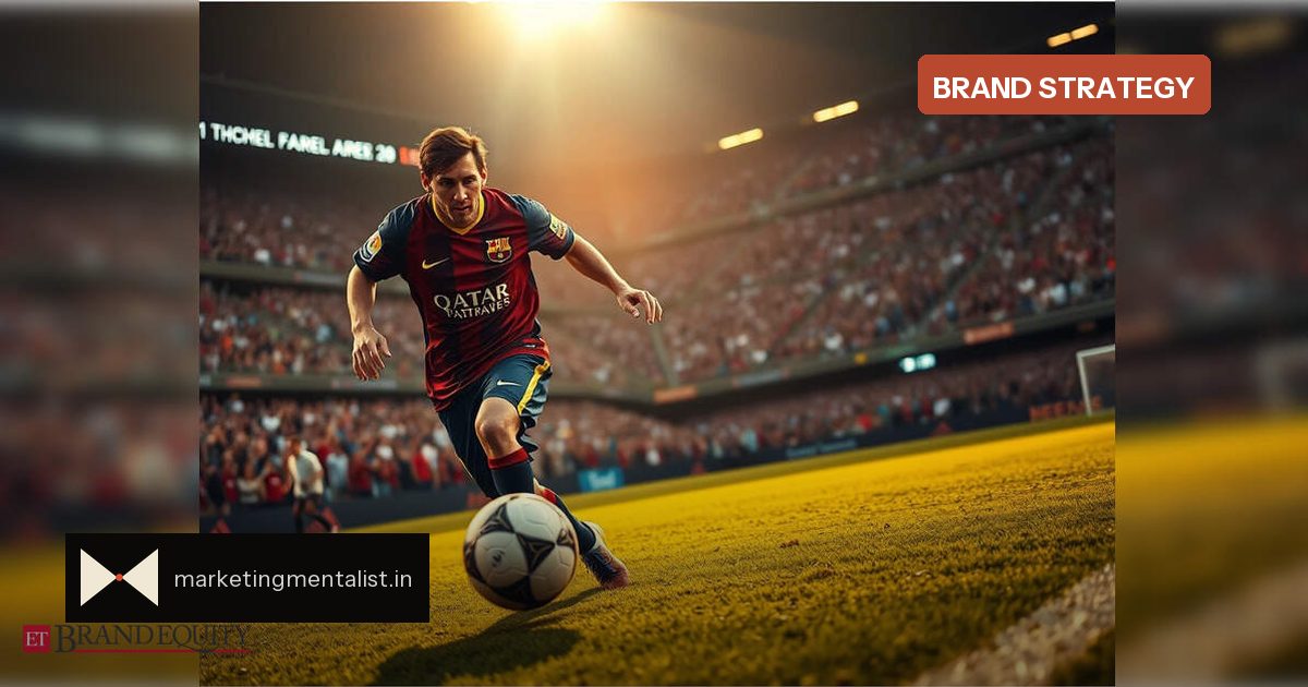
After Lionel Messi retired from Argentina’s national team on August 31, most brands posted a thank-you. Rexona Argentina shipped something fans could use.
The Unilever deodorant brand launched GOAT Font, a free typeface built from real moments in Messi’s international career. Instead of imitating his handwriting, the letters trace the paths of actual runs, dribbles and changes of direction he made in Argentina’s shirt.
Movement as identity
Designer Pedro Destefano reportedly combined artificial intelligence with manual tracing to turn those paths into glyphs. Some characters curve sharply, others loop or double back, echoing the indirect routes Messi often took on the pitch. The result feels unconventional because Messi rarely reached his destination the conventional way.
That choice matters. The font does not borrow Messi’s name or face as decoration; it encodes the movement that made him unmistakable. It is a distinctive brand asset built from a person’s signature motion rather than a static image.
From tribute to utility
Rexona made GOAT Font free to download, so supporters can use it in posters, graphics and personal tributes. The brand’s farewell message became something fans can touch, set and share. That gives the campaign a life beyond a single social post.
This is the difference between a tribute ad and a participation asset. A tribute ends when scrolling stops; a tool circulates every time someone sets a headline in Messi-shaped letters.
Why it works
Custom athlete typefaces are not new. Nike’s studio work with Sawdust produced fonts for LeBron James, Kobe Bryant and Kevin Durant, each matched to a body, posture and persona. Independent designers have done the same with a MO SALAH font family. What makes Rexona’s version feel fresh is the source material: not a logo or a silhouette, but decision-making in motion.
- LeBron: broad, boxy letterforms mirroring his stature and King James crown.
- Kobe: sharp, geometric shapes aligned with a precise identity.
- KD: fluid, elongated letters drawn from his frame and signature lines.
- Messi: unpredictable paths turned into letters, not a polished portrait.
What marketers can borrow
Ask what makes the partner or icon unmistakable, then turn that into something usable. A font is one format; the principle is bigger. A free asset, anchored in real behaviour, extends reach and gives fans a reason to co-create.
For Indian brands, the same logic could apply to Sachin’s number 10 or Virat’s 18, though the more interesting move is not the number but the movement, ritual or habit fans already associate with the person.
Source: ETBrandEquity.com