What Paramount-WBD Rebrand Churn Teaches Brands
Frequent logo overhauls at Paramount and Warner Bros. Discovery reveal how brand identity becomes shorthand for strategic instability.
The rebrand as distress signal
Paramount Skydance and Warner Bros. Discovery are moving toward a combination that would put CEO David Ellison in charge of some of the most recognisable marks in American entertainment. But the recent visual history of both companies tells a less confident story. Multiple refreshes, hybrid logos and quick course corrections now read as visual shorthand for falling revenue and consolidation—not quiet brand stewardship.
From a branding psychology perspective, that matters. Identity decisions are strategy signals. When a company redesigns twice in a few years, it usually means the business story has not settled.
Paramount: heritage meets hybrid
Skydance Media, founded by David Ellison, acquired Paramount in 2025. Skydance had built credibility as a production company with credits ranging from 2011’s Mission: Impossible — Ghost Protocol to 2022’s Top Gun: Maverick. The deal brought in major media assets: CBS News, MTV and franchises such as SpongeBob SquarePants.
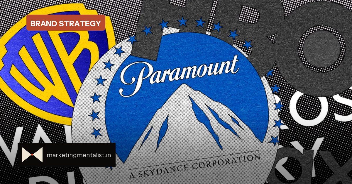
The first merger logo tried to combine Paramount’s mountain-and-stars mark, inspired by Ben Lomond Mountain in Northern Utah, with Skydance’s serif wordmark. The result looked more like negotiation than identity. The company later restored a version of the Paramount script wordmark and added “A Skydance Corporation” in all-caps serifs below—an acknowledgment that the hybrid had not landed.
Warner Bros.: refresh, then repeat
Warner Bros. has been through a similar loop. In 2019, Pentagram partner Emily Oberman refined the classic shield, elongated it and introduced a brighter blue for what was then WarnerMedia’s first major refresh in decades. Just three years later, after the AT&T spin-off and Discovery combination, Chermayeff & Geismar & Haviv reworked the identity again. An early wordmark drew unfavourable comparisons, and the final system changed the shield into a rounder shape with a plain sans-serif “Warner Bros. Discovery” lockup.
Why identity churn damages brand memory
A logo is not decoration. It is a retrieval cue—one of the distinctive assets that lets consumers recognise a brand before they consciously read a word. When those cues keep moving, recognition slows and associations weaken. A single post-merger rebrand can be necessary; two within three years suggests the strategy is still searching for a centre.
For brand managers, the takeaway is clear:
- Treat logos as memory shortcuts, not mood boards.
- Lead with the strongest heritage asset, not an equal split.
- Keep transitional identities legible at small sizes.
- Test recognition speed before announcing a new look.
Read identity as a strategic indicator
There is a reason heritage marks survive acquisition talks: they encode trust built over decades. When a merger pushes two marks together instead of choosing a lead, the new identity often communicates internal compromise rather than customer clarity. The clearest identity systems give consumers one dominant cue and a small set of consistent secondary elements. That is why the Paramount script’s comeback and the Warner shield’s repeated reshaping feel less like design progress than like visible renegotiation.
What to do before the next merger mark
Before merging identities, audit which visual assets carry the most equity. Paramount’s mountain and Warner’s shield are the anchors; the typography was secondary. The fastest route to a confident system is usually to preserve one anchor and quietly adapt the supporting elements. If both sides demand equal representation, the result often pleases the boardroom but confuses the market.
Run recall tests with real consumers, not only internal stakeholders, and measure whether the new mark strengthens or slows recognition. Most of all, treat identity as a long-term commitment rather than a design task to be repeated whenever the org chart changes.
Source: Fast Company