Arsenal’s Rocastle Font Turns Club History Into Brand Equity
Arsenal's new Rocastle blackletter typeface shows how a 140-year-old club turns player legacy and archive into flexible brand equity.
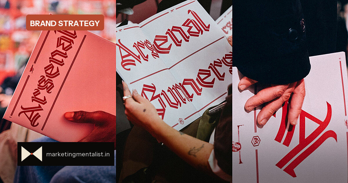
Arsenal has always carried its history in its crest and cannon. Now the club is extending that heritage into typography. In October, the 140-year-old club unveiled Rocastle, a modern blackletter typeface named for the beloved late player David Rocastle (1967–2001), at a pop-up exhibition at London’s Design Museum.
Rocastle was created by David Rudnick, founder of research and design studio terrain, with Léa Bruneau. Rudnick, an Arsenal fan, told Fast Company he “would only ever have worked with one club.” He is also the architect of a bespoke font book developed over the past four years.
A type system built on three pillars
Arsenal began updating its typography in 2022. Rudnick designed three fonts licensed exclusively to the club around three pillars: team, community, and culture. Rocastle represents culture — in the curator’s words, “where football intersects with fashion, art, music, and more.” That positioning is deliberate: the design is intended to work in a fashion drop or on the walls of a museum show, feeling contemporary but heritage.
The research was deep. The team assembled hundreds of pieces of Arsenal memorabilia and type specimens before drawing the letters. The result includes a blackletter “A” mark that now sits alongside the crest and cannon as one of the club’s three primary logos, inspired by the lettering in the retro VCC crest (Victoria Concordia Crescit, “victory grows through harmony”).
The contradictory brief every brand faces
The typeface is unmistakably blackletter, but an inline weight and swashes that recall pennants in the wind make it feel modern and English. Rudnick said the work had to do “a lot of very difficult contradictory things”: it had to be bold and proud enough to act as a “glorious pinnacle” of the identity, while remaining simple, legible and applicable for everyday use. He describes the effect as “something that feels more chivalric or knightly.”
That tension is what makes it useful rather than decorative. Here is the framework:
- Specific nostalgia beats generic nostalgia. Rocastle points to a real player and Arsenal’s own VCC crest, not a generic “old sport” mood.
- Pillars create portfolios. Three fonts — team, community, culture — let the club flex tone without losing coherence.
- Ownability must meet operability. The blackletter mark is distinctive, but the fuller typeface still has to read at small sizes and across fashion, digital and print.
What to do with this
If you’re refreshing a legacy brand, don’t ask only whether a visual cue is “on brand.” Ask whether it can do two jobs: carry a specific story and survive daily use. Rocastle works because the name is meaningful, the letters stay legible, and the system connects an archive to future product drops. If a heritage element fails the legibility or scalability test, it is decoration, not identity.
For Arsenal, the long-term play is clear: typography becomes a flexible brand asset that can move from the pitch to culture without changing its DNA. For marketers everywhere, that is the real lesson behind one football club’s new font.
Source: Fast Company