
Apple Music’s new logo turns sound into ripples
Apple Music's new identity turns sound into ripples—built with a transducer, mineral oil, and a sonic logo constrained by what the eye can read.
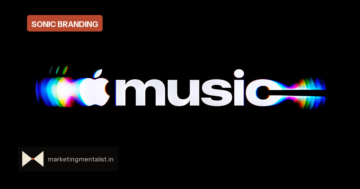
Apple Music is rolling out a new brand system: a custom wordmark, a short sonic logo, and a rippling visual language that takes the platform closer to the actual physics of music. The identity, developed with TBWA\Media Arts Lab, producer Fred again.., and Nest Acoustics, starts appearing on Apple Music’s original content and events this week before expanding to marketing, product, and experiences.
The brief was deliberately simple: the identity should look as though it was built from actual music, using practical effects rather than fully digital renders. That meant the team had to convert audio into something visible.
Turning frequencies into a logo
The core device was a transducer—a piece of kit that turns an audio signal into physical vibration. Engineers played different frequencies through it into a liquid bath, adjusting notes and watching how the surface responded. The results became the raw material for both the sonic logo and the visual ripple pattern.
Once the sound was composed, the team placed the transducer in a bath of mineral oil. The oil’s viscosity made the surface behave like glass being rippled by sound. Beneath that oil sat acrylic versions of Apple Music’s note logo and the updated wordmark, now set in a chunkier custom version of SF Pro. The finished ripple is not a stylised effect; it is a physical trace of the final composition.
Constraints made the identity legible
One insight matters most for brand builders: the team discovered that too many notes, or notes pitched too high, created excessive movement that made the imagery hard to read. That physical limit forced the musicians to simplify. The sonic logo had to earn its screen time under real-world constraints—and the same restraint helped the visual lock into memory more easily.
This is sound and image being designed as one asset, not two. Most brands add a sonic mark after the visual identity is finished. Apple Music reversed that: sound came first, and the visual system inherited its shape.
Why congruence wins
A distinctive brand asset is any cue—logo, colour, sound—that triggers the brand without the name. Apple Music’s new system bundles several of these cues into one event: the wordmark, note, ripple, and sonic logo all point to the same idea. When a fan sees the ripple in a feed, the memory of the sound can be activated; when they hear the sonic logo, the image is cued. That pairing raises the odds the brand is recalled, without relying on a long name lockup.
What marketers should borrow
- Compose the constraint. Sensory or physical limits are not obstacles; they force recognisable, simpler choices.
- Keep audio and visual congruent. A sonic logo that literally matches the visual mark is easier to encode as a single memory.
- Favour proprietary craft. A handmade ripple is difficult to copy, which makes the identity a defensible brand asset.
The lesson is not that every brand needs mineral oil. It is that distinctiveness improves when you build a system around one sensory truth—and let the limitations of that medium shape the work.
Source: Fast Company