Brisbane 2032 logo: the hidden meaning behind the new emblem
The Brisbane 2032 emblem works as a torch, a cockatoo crest, the Queensland map and the year '32 - an accidental masterclass in layered branding.
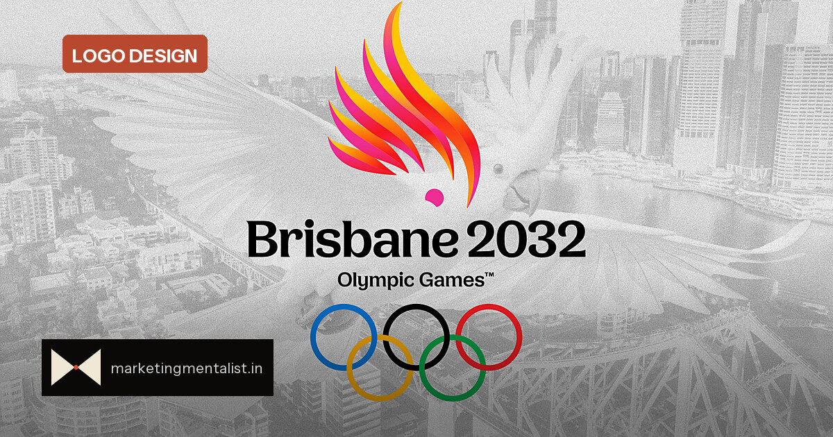
Brisbane 2032 organisers did not plan to unveil their emblem this way. A video explaining the new Olympic and Paralympic mark was posted to the organisers’ YouTube page, turning a quiet branding reveal into an accidental design tour. The immediate read is a five-flame Olympic torch. The explainer shows the same shapes working much harder.
The layers packed into one mark
Look past the torch and the emblem becomes a list of deliberate choices:
- Five feathers in a cockatoo’s crest, grouped in bunches of three and two to encode the year ’32.
- A crest that sits inside the outline of Queensland, the Australian state Brisbane calls home.
- A cockatoo chosen for its cheeky, playful spirit and its significance to First Nations people.
- Two colourways: pink with orange for the Olympic pink cockatoo, and yellow to pink for the Paralympic sulphur-crested cockatoo.
Brisbane 2032 president Andrew Liveris said in a statement that Games emblems are “an opportunity to promote the unique character” of a host city, which is why “multiple elements have been subtly woven together.”
Why hidden meaning builds brand pull
For brand managers, Brisbane’s approach is a lesson in discoverable design. A logo with one immediate read and several slower reveals gives people a puzzle to solve. That small decoding effort can make the mark feel more valuable and more shareable: once you spot the ’32 in the feather grouping, you want to show someone else.
The two colourways also keep the Olympic and Paralympic identities distinct while sharing a single system – a useful trick for brand architectures that need to feel like one family without identical twins.
The playbook in a logo
Brisbane 2032 is a template for what brand strategists call layered identity: one set of shapes carrying several meanings that reveal themselves in stages. The torch delivers the Olympics category cue; the cockatoo delivers local character; the map delivers place; the 3+2 grouping delivers time. No element is there by accident, and each layer has a one-sentence explanation.
There is a risk in hidden meanings: if nobody can see them, they only impress the designers. Brisbane avoids that by putting the explanation into the official video. The layers are hidden enough to reward attention but explained enough to start the story.
What brand teams should steal
The consortium behind the work – announced last year and including VML, Landor, Kantar Public and First Nations consultancy BlackCard – shows how layered identity benefits from multiple lenses: brand design, consumer research and local cultural knowledge. The strongest hidden meanings are anchored in place or culture, not added as decorative afterthoughts.
The mascot reveal is still ahead, so Brisbane 2032 has another chance to keep the same narrative engine running: give people a story they can retell.
Source: Fast Company