The Napkin Test: When Packaging Becomes a Brand Asset
Good packaging wins the shelf. Great packaging escapes it. A designer's four-bucket framework — and the napkin test that separates assets from wrapping paper.
Ask any brand team what they want from a new pack and you’ll hear the same three wishes: stand out, look modern, get noticed on shelf. All reasonable. All obsessed with a single moment — the first encounter.
In a column for ETBrandEquity, Radhika Dhuru, Executive Creative Director at Open Strategy & Design, argues that this is the wrong question to optimise for. The better one, she writes, is what happens when someone sees the same pack for the tenth time, the hundredth time, or years later. Her line: good packaging gets attention, great packaging builds a brand asset.
Why “make it pop” is a tactical win
When a client asks for more impact, the easiest move is to turn up the volume — brighter, louder, busier. Dhuru is candid that she understands the impulse; the supermarket shelf is a brutal place to debut. But attention, she notes, is temporary. What lasts is what she calls escape velocity: the point at which a visual code detaches from the physical box and starts living in memory and culture.
For our readers, this maps neatly onto what behavioural scientists call distinctive brand assets — colours, shapes, characters and type that act as mental shortcuts. The brain doesn’t retrieve your positioning statement in the aisle. It retrieves a cue. Novelty resets that cue. Repetition compounds it.
The four buckets
- The power of doing absolutely nothing. Creative teams get bored faster than consumers do. Dhuru cites Parle-G: graphically simple, but held steady for decades until the yellow pack became a childhood trigger for a billion people. The bravest design decision is often the refusal to refresh.
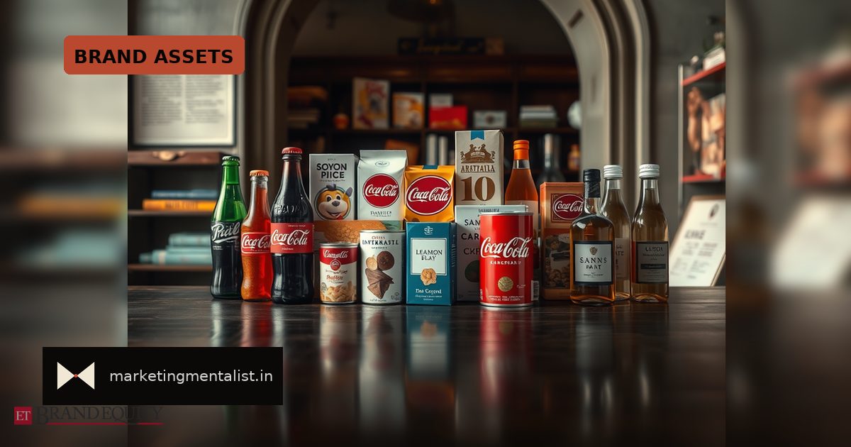
- When the wrapper migrates. A real asset can leave the box and run the brand’s wider world. Fevicol is her Indian benchmark — you know the joint-family ad without needing to see the pack. Paper Boat’s kraft-paper, retro aesthetic became the brief for its animated films. Coca-Cola’s contour bottle works as a flat silhouette because our brains fill in the rest.
- Recognition in the wild. Packaging doesn’t stop working at checkout. Mokobara solved the anonymity of luggage on a baggage carousel with distinct form and specific colour palettes — spottable from 50 feet away, and instantly identifiable in someone’s travel Reel.
- Build a world, not a label. Young brands don’t have decades of consistency banked. The Whole Truth used what Dhuru describes as typographic brute force — you recognise the font before the jar. Slurrp Farm built an illustrated children’s universe whose characters travel from cereal box to activity book to YouTube intact.
The napkin test
Her closing diagnostic is disarmingly simple. Hand someone a cocktail napkin and a pen and ask them to draw your brand. If they can, you have an asset. If they can’t, you have wrapping paper.
It works because it filters for the only thing that matters in low-attention categories: retrievability. Detail dies in memory. Silhouettes, single colours, one character and one typographic gesture survive. That’s why the test rewards reduction, not decoration.
What to do on Monday
Run the napkin test internally first, then with 20 category buyers who are not your customers. Then audit honestly:
One, list your assets and score each on fame (how many recognise it) and uniqueness (how many attribute it correctly to you). Anything that scores low on uniqueness is a category convention, not an asset — a green leaf on a wellness pack, a chef’s hat on a masala box.
Two, check whether your codes survive off-pack. Can your asset carry a 6-second ad, a delivery-app thumbnail, a quick-commerce tile at 200 pixels? If it needs the logo to be legible, it hasn’t escaped yet.
Three, put a cost on redesign. Every refresh spends accumulated memory. Change what fails — legibility, hierarchy, shelf navigation — and protect what people already store in their heads.
The uncomfortable truth for brand managers is that the boredom threshold sits inside your office, not inside your buyer’s head. Your consumer sees the pack for four seconds a month. You see it every day. Design for their tenth encounter, not your first.
Source: ETBrandEquity.com