What Turion Space’s rebrand teaches about proof and vision
Turion Space outgrew its debris-removal identity and built a brand that carries both current proof and a hundred-year vision.
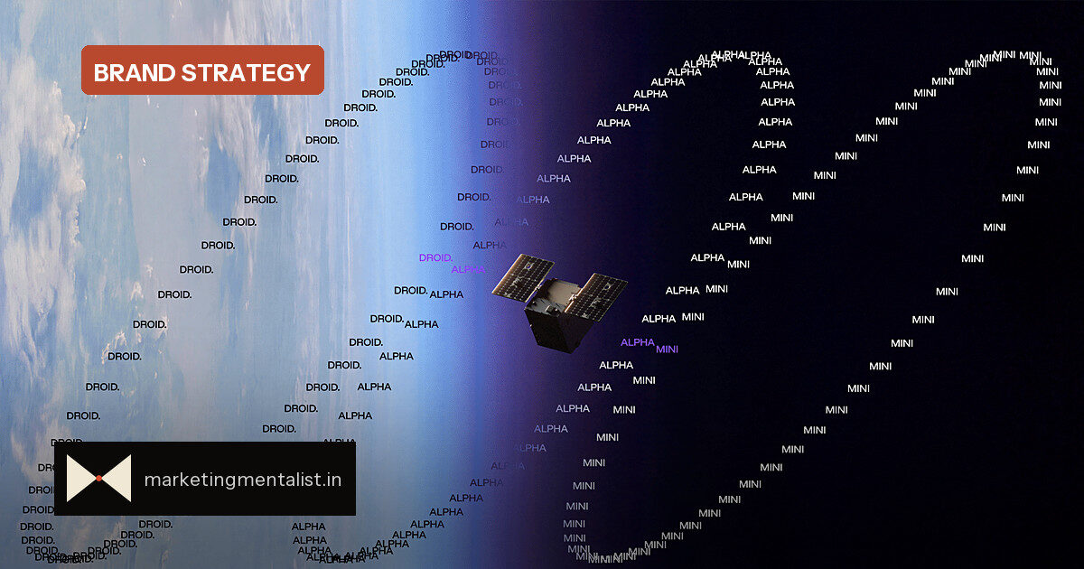
Turion Space began life in 2020 with a specific job: remove debris from orbit. The Irvine, California company has since shifted into building the vehicles, software and payloads that help spacecraft move, manoeuvre, collect data and carry out missions. That is a very different business, with a much bigger set of government and commercial buyers watching.
As the company changed, the old brand did not. The original identity leaned on Turion’s early debris-removal focus, with a literal orbital motif in the wordmark and a navy-on-white corporate look. Once the company moved into mission software, space logistics and increasingly complex government programs, that identity started working against the pitch. It made a broader company look narrow.
The rebrand brief is a positioning problem
Turion called on Buck and Wild, both part of the Residence network, to rebuild its identity, brand world and website. But the real tension was not aesthetic. Sid Fritts, former head of marketing and brand at Turion, said the team wanted to go beyond “the generic space-defense identity so many companies in this category default to.”
What makes the brief interesting for marketers is its two-sided demand. Turion already has two satellites in orbit, so the identity could not feel like a speculative startup deck. At the same time, the company’s long-term vision, Starforge, points toward deep-space infrastructure and resource extraction, which some buyers could read as a distraction. Fritts called it “the result of compounding capability, where each product line we ship today builds directly toward it.”
So the design system had to be credible at both extremes.
A spec sheet and a century-long thesis
The same brand has to carry a spec sheet for a mission operator and a thesis about the next hundred years in orbit, and both have to feel like the same company.
That line, from Fritts, is not a design critique. It is a brand architecture brief. For any B2B brand, the same rule applies. Your identity has to perform at two altitudes:
- The micro artefact: the spec sheet, the dashboard, the sales deck, the packaging that has to signal “we can deliver today.”
- The macro narrative: the vision, the mission, the category argument that has to justify attention and a premium over the next decade.
When a brand over-indexes on the macro vision, buyers dismiss it as vapourware. When it over-indexes on the micro artefact, buyers treat it as a commodity vendor. The skill is in building one system that flexes between the two without changing personality.
What brand managers can reuse tomorrow
Turion’s approach is a simple brief exercise. Before you redesign anything, name the two ends your brand must hold, then test concepts against both. If a logo looks great on a vision deck but collapses on a one-page spec sheet, it is not the system. If it works on the spec sheet but disappears in a keynote about the next decade, it is also not the system.
The second move is category awareness. Space and defence branding is full of defaults: orbital rings, dark blues, stars, chevrons. Those codes may feel safe, but they do not signal a different strategy; they signal membership in a category. A rebrand is a chance to be recognised as distinct, not just compliant.
The psychology here is simple. Buyers in complex, multi-stakeholder purchases are looking for both evidence of competence and a reason to believe the partner will matter later. A brand that can hold both ends lowers the mental cost of buying from a younger, less familiar player, which is exactly what Turion needs as it competes with established aerospace and defence contractors.
Source: Fast Company