Fewer choices can lift purchase rates 10x
Why the jam study's 10x conversion gap shows consumers are predictably irrational, and how to design choice architecture that works with System 1.
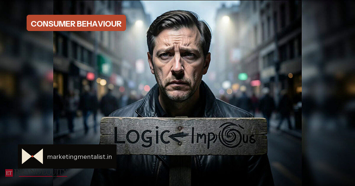
The customer arriving at your product page is not one decision-maker but two systems fighting inside the same skull. The logical consumer weighs price, features and proof. The human skims, pattern-matches and defaults to whatever feels easy. Behavioural economics shows the second version usually wins.
Game theory long assumed humans are rational agents who maximise utility. As Prof. Viswanath Pingali and Lavanya Kurup write, the more accurate assumption is what Herbert Simon called bounded rationality: people deviate from logic, but the deviations are not random. They are, in Dan Ariely’s phrase, predictably irrational.
Two systems run every buying decision
Kahneman’s framework splits thinking into System 1, which is fast, associative and pattern-seeking, and System 2, which is slow, effortful and capacity-limited. Under cognitive load, people default to short heuristics. That means most purchases are not careful comparisons; they are rapid pattern-matches.
Spotify’s shuffle felt wrong when it was right
Spotify’s original shuffle was mathematically random, yet users complained it was broken. The fix was to make shuffle less random so it felt more random. User perception trumps mathematical purity—and a song’s perceived value is heavily shaped by the track that played before it.
The jam study every conversion team should memorise
Iyengar and Lepper’s landmark experiment offered shoppers either 6 or 24 jam varieties to taste. The larger display attracted more browsers, but the limited-choice table converted far more buyers—purchase rates were roughly ten times higher when choice was constrained.
What marketers should do
- Reduce options at the moment of decision. More variety creates an avoidance response when the mind cannot pattern-match quickly.
- Make the preferred choice the default. Pre-selected options and single-tap actions keep decisions inside fast System 1 processing.
- Design for salience. A feature has high strategic value when it is both salient and discriminative—like a pink circle in a sea of green circles.
- Respect existing mental models. Clarity is what survives contact with a mind that was almost never going to process the screen rationally.
The ethical line between good and manipulative design
Good interface design works with bounded cognition to reduce friction and support better decisions. Manipulative design works around blind spots—poor randomness detection, memory decay, pattern-seeking—to extract engagement the user would not consciously choose. The difference is whether you help the human or exploit the predictable human.
That is why markets behave as an evolving behavioural system: firms signal, consumers selectively attend, competitors respond, and attention itself determines what becomes salient next. Brands that design for both the logical consumer and the predictably irrational human will keep the advantage.
Source: ETBrandEquity.com